The reports, and which one to open
You have a question. Which report answers it?
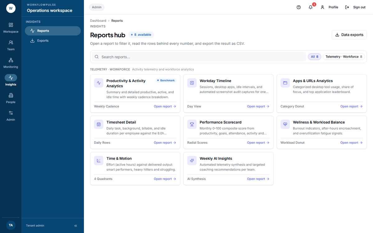 The hub sorts reports by what they are built from. The cards below sort them by what you want to know, which is usually the faster way in.
Pick by the question
Section titled “Pick by the question”Who can open which
Section titled “Who can open which”Reports are for managers, tenant admins and auditors.
Two are also open to an employee — Timeline and Timesheet detail — and both narrow to that person’s own rows on the server, not in the interface.
Monthly client billing is narrower still: tenant admins and auditors only. A manager cannot open it.
The three billing reports disappear entirely in a workspace that counts productivity rather than tasks.
Four facts that apply to all of them
Section titled “Four facts that apply to all of them”Two limits that are easy to hit
Section titled “Two limits that are easy to hit”A sensible order
Section titled “A sensible order”-
Activity — is everybody tracking? Compare the people count against your headcount. Fix coverage before anything else.
-
App and website use — how much is unclassified? Under 10% is healthy. Above 25% and the productive share is not worth arguing about.
-
Wellness — is anybody in trouble? This one is about people, and it does not wait for the other two to be right.
-
Project summary or Billing — did the money land where you think it did?
-
Scorecard and Time and Motion, last.
Steps 4 and 5 are built on 1 and 2. Reading them first is how a bad number gets into a conversation you cannot take back.
Next: Activity · App and website use